Gallery
Every form the figure library can draw. The point is the shape, not the finding, so almost everything below plots the same 342 penguins: hold the data still and the differences between the forms are the only thing left moving.
Each caption says what the form is good at and what it hides, because those are the same sentence read from two directions.
The data. palmerpenguins, Horst AM, Hill AP and Gorman KB, 2020, 10.5281/zenodo.3960218, CC0, retrieved 1 September 2026. Collected by Dr Kristen Gorman and the Palmer Station Long Term Ecological Research Program. Two of the 344 records have no flipper measurement and were dropped; every column was kept and renamed for readability. Figures using bill, mass or sex are drawn from the 333 records where all of those are present. Nothing was averaged, rescaled, trimmed or excluded as an outlier.
Relationships
Two measurements against each other, one point per bird. Nothing is aggregated, so it is the honest default whenever the sample is small enough to draw. It stops working when points overlap faster than you can count them.
Scatter with fits, per group and overall
Simpson's paradox in real measurements. Bill length and depth fall together across the whole sample, shown by the dashed line, and rise together inside every single species. Fitting once through everything reports the opposite of what is happening.
For when there are more points than the eye can separate. Reads density honestly at any sample size, and loses every individual, including the outlier that might have been the finding.
The shape of each group with the observations still visible underneath. Contours state where the mass is; the points keep you honest about how little of it there may be.
One variable
Counts per bin. Simple and familiar, and entirely at the mercy of where the bin edges land: the same data with different breaks can look unimodal or bimodal.
Every measurement placed, with overlapping points nudged sideways rather than hidden. The right default up to a few hundred observations, and this site's house form.
Quartiles, whiskers and outliers in very little space, which is what makes it useful for twenty groups at once. It will show two identical boxes for a distribution with one peak and a distribution with two.
Distributions stacked so their shapes can be compared directly. Better than a box plot wherever the shape matters, and it needs vertical room that a panel of twelve will not have.
Empirical cumulative distribution
Every observation on one line, with no binning decision to argue about. It answers what proportion lies below any value directly. Fewer readers can read one at a glance, which is a real cost.
Comparisons
Dot and error, with the observations behind
A group mean, a standard deviation, and every bird that produced them. The summary and the spread in one figure, which is what a bar chart with an error bar is usually trying and failing to be.
Two conditions per group, joined, so the direction and steepness of the change is what you read rather than something you compute from two bar heights.
The gap between two values per category, when the gap is the finding. Reads the difference directly, and gives up the ability to show a distribution.
One panel per group on shared scales. The answer to overplotting that does not throw anything away, and the reason it is not always right is that comparison across panels is harder than comparison within one.
Counts across two categories. Legitimate here because a count really does start at zero and really is a length. Grouped rather than stacked, so every bar shares a baseline and can be compared.
A box plot of body mass per species wipes to reveal every individual measurement on the identical axis, showing that Adelie and Chinstrap overlap almost completely while Gentoo sits above both.
Drag, or use the arrow keys. At 0 the whole frame is box plot; at 100 it is every measurement.
A summary against the observations, on one axis
Both halves share an axis, tick for tick, so only the marks change. The boxes are a fair summary. They would look much the same for a distribution with one peak and a distribution with two, and the points would not.
Every pair of measurements at once, as a way of deciding which relationship deserves a proper figure. A diverging scale with a neutral midpoint, because zero correlation is a meaningful middle and not just a low value.
Forms that need other data
Nothing below is data. Every value comes from an equation printed with the figure, or from a seeded generator, and exists only so the shape can be shown. No experiment produced any of it, and none of it may be reused in a piece: a piece needs the real deposited data behind the real result.
Curves from the four-parameter logistic, y = bottom + (top - bottom) / (1 + (EC50/x)^hill), with bottom 2, top 98, hill 1.3, and EC50 12 nM for compound A and 140 nM for compound B. Points are three replicates per dose scattered about the curve. The x axis is logarithmic, which is what makes a sigmoid of it.
A step function from an example cohort of forty per arm, event times drawn from an exponential with medians of 22 and 41 days, censored at 60. Steps rather than a smooth line, because nothing is known between one event and the next and drawing a slope there would claim otherwise.
Effect size against significance for two thousand generated features, most null and a small tail with real effects. Grey for what does not clear the thresholds, so the eye is not asked to weigh two thousand equally coloured points.
Logistic growth, N(t) = K / (1 + ((K - N0)/N0) e^(-rt)), with K 1, N0 0.02, and three growth rates. Labelled at the end of each line rather than in a legend.
Scroll-driven
One figure in four states, for walking a reader through a result a step at a time. Scroll through it. With JavaScript off, or with reduced motion asked for, the four states stand as a numbered sequence and the steps are numbered to match: nothing has to move for it to be readable.
-
Every bird in the sample, bill length against bill depth. One cloud, no groups asserted yet.
333 measurements, one colour.
-
Fit a line through all of it and the relationship is negative: longer bills are shallower. That is a correct calculation on these numbers.
A single regression line added, sloping down.
-
Colour by species and the cloud turns out to be three clouds, each sitting in a different part of the range.
The same points, coloured by species, with the overall line faded.
-
Fit a line within each species and every one slopes upward. Within a species, longer bills are deeper. The overall line was measuring the difference between species, not the relationship inside any of them.
A regression line and confidence band per species, all sloping up, with the overall line dashed behind them.
A line through everything, and a line through each
The same 333 birds four times. A single fit through the whole sample slopes downward. A fit within each species slopes upward, every time. Both lines are correct arithmetic on the same numbers.
Three dimensions
The test for 3D is whether the third dimension carries information the reader needs. An antibody passes it: the Y is a real shape, the two arms sit at an angle to each other that no side-on projection conveys, and the hinge that lets them move is the first thing a flat figure loses.
The crystal structure of an intact IgG2a monoclonal antibody, 10,434 atoms, shown as a ribbon. Two Fab arms extend from a hinge region at an angle to one another, with the Fc stem below, making the characteristic Y.
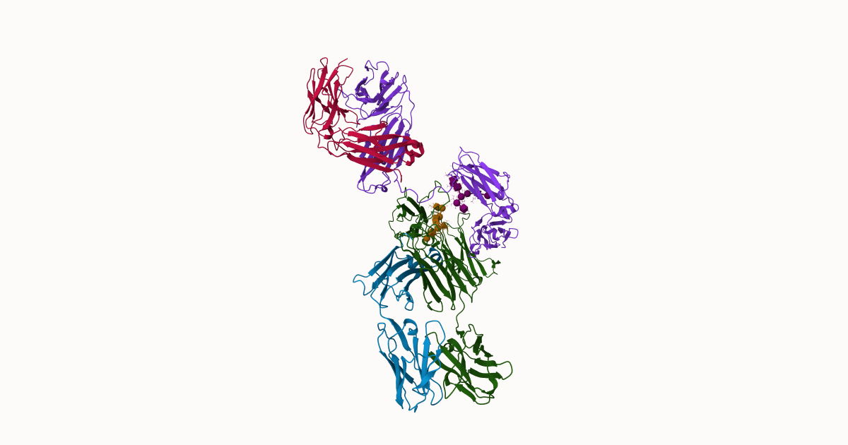
The whole molecule, not a fragment. Two Fab arms that bind antigen, one Fc stem that the rest of the immune system reads, and a hinge between them. Most published figures of an antibody are a cartoon of a Y; this is the measured thing, at 2.8 angstrom.
Nothing is downloaded until the button is pressed. Until then the page has fetched a still, and the still and the caption carry the point on their own. Auto-rotation is off for anyone who has asked for reduced motion.
Depth
A confocal stack is a sequence of optical sections, and it is almost always published as one flat image: the brightest value along each line of sight, from every section at once. That picture is easy to make and easy to misread, because it puts objects at different depths on top of one another and shows a hollow shell as a filled disc.
A confocal stack of mouse embryo nuclei. In a single optical section about ten nuclei are in focus, each showing LaminB1 as a bright ring around a darker interior. In the maximum-intensity projection roughly twenty-five nuclei appear together and each ring is filled, so depth and hollowness are both lost.
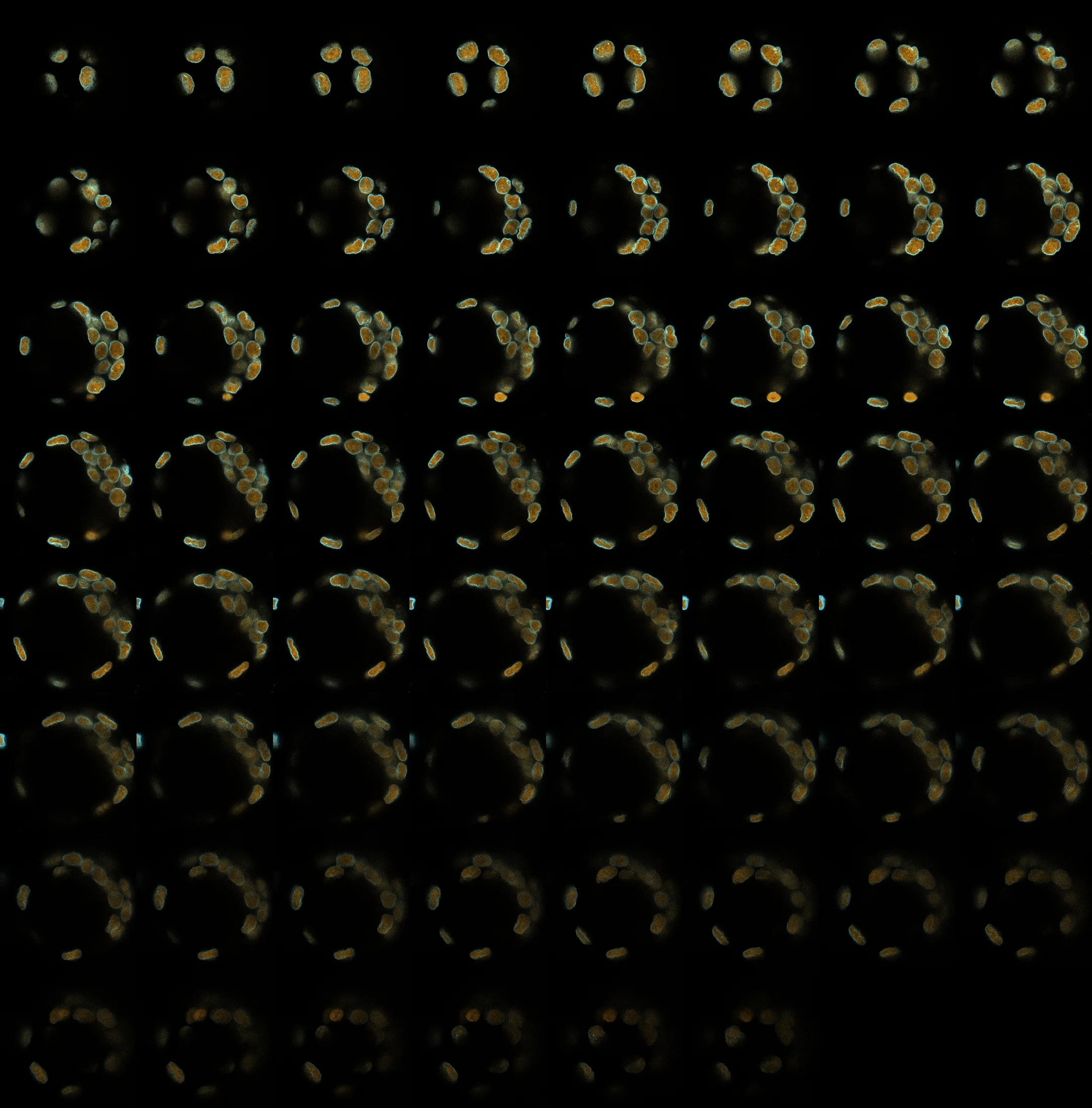
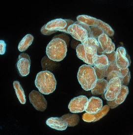
Every optical section in the stack, in order. Move through them one at a time with the slider once it appears.
Nuclei in a mouse embryo, section by section
Move through the 62 sections and watch nuclei come into focus and leave again: at any one depth about a third of them are present. Switch to the projection and all of them appear at once, in the same plane, each envelope filled in rather than hollow.
Blue is LaminB1, at the nuclear envelope. Amber is DAPI, the chromatin inside it. Every section is in one image that loads once, so moving through depth costs nothing after that.
A three-dimensional cloud of 90,167 Gaussians reconstructed from the confocal stack. Nuclei appear as hollow blue shells with amber interiors, distributed through the depth of the volume rather than lying in one plane.
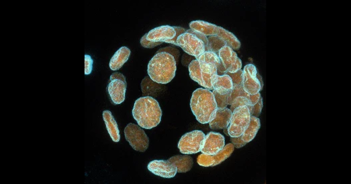
Every voxel above a threshold becomes one 3D Gaussian, 90,167 of them, positioned in micrometres from the microscope's own voxel spacing. Turn it and the nuclei separate in depth: what the projection stacked into one plane is a cloud about 93 micrometres deep.
Splatting suits this because the source is a measured volume rather than geometry. The opposite case, splatting a molecular structure whose coordinates are already known exactly, would be a mistake: a mesh is smaller, sharper and more faithful. What is here is the plain conversion, one Gaussian per voxel. Fitting Gaussians to a volume, which is where the research currently is, is a harder problem and a different figure.
How these are drawn
Every chart on this page is drawn when the site is built, so what arrives is the figure and not the machinery for making one. There is no charting library to download, the figures are there with scripts switched off, and they appear intact in the feed and on paper. The molecular structure and the Gaussian scene are the two exceptions, and neither fetches anything until you ask it to.
Colour comes from one palette file and nothing on the site may name a colour of its own. Those palettes are free to take, as hex lists and as lookup tables you can drop straight into Fiji.