A figure is an instrument
Which chart you choose changes what people take away. That is a measured effect, not a matter of taste.
There is a habit of speaking about figures as though the choices in them were matters of taste. A reviewer prefers the bar chart. An editor finds the colours busy. A supervisor has always used pie charts and sees no reason to stop.
The habit is comfortable and it is wrong, and it has been demonstrably wrong for about forty years. Which encoding you choose changes how accurately people read the numbers, by amounts that have been measured in controlled experiments and replicated since. A figure is not decoration applied to a result. It is the instrument through which the reader takes the measurement, and instruments can be calibrated.
The reader’s instrument, calibrated
Cleveland and McGill put this on a formal footing in 1984. They set out a list of elementary perceptual tasks, the small judgements a reader makes when decoding a chart, and ran experiments to find how accurately people perform each one. Position along a common scale came out at the top. Angle and area came a long way below it.
That is a statement about people, not about charts. It is why a dot plot and a pie chart of the same numbers are not two presentations of one result.
An interactive self-test. It shows two quantities encoded as positions on a scale, as lengths of unaligned bars, as angles of pie slices, or as areas of circles, and asks the reader to estimate the smaller as a percentage of the larger. Without JavaScript it shows the published ranking instead: position on a common scale is read most accurately, then length, then angle, then area.
What the studies found
Cleveland and McGill ranked elementary perceptual tasks by how accurately people read them. Position on a common scale came top. Angle and area came far below it. That ordering, rather than any particular number, is the finding:
- Position on a common scaletwo dots on one axis
- Length, not alignedtwo bars with different baselines
- Angletwo slices of a circle
- Areatwo circles
There is a self-test here that lets you try the four encodings yourself. It needs JavaScript, which is not running. The findings above are the point of it and do not.
Four ways of showing the same comparison
The same judgement, asked four ways. Position on a common scale is the one people read most accurately; angle and area are much worse. Your own twelve attempts prove nothing, which the results say plainly.
What a bar does to a reader
The most-used chart in the life sciences is a bar of a group mean with an error bar on top, and the case against it is usually made on the grounds that it hides the distribution. That is true and it is the smaller half of the problem.
Newman and Scholl reported in 2012 that readers do something stranger. Shown a bar representing an average, people judge a value that falls inside the bar as more likely to be a real observation than a value the same distance from the mean but outside it. The bar is a shape with an inside and an outside, and readers treat that boundary as if it meant something. It does not. The distribution is symmetric about the mean and the bar’s edge is an artefact of the encoding.
So a bar chart does not merely fail to show the spread. It puts a boundary in the reader’s mind where the data have none.
A bar chart of three species means wipes to reveal every individual measurement on the identical axis. All 342 birds sit between 172 and 231 millimetres, in the top fifth of the plot, while the bars fill the whole height from zero.
Drag, or use the arrow keys. At 0 the whole frame is mean and standard error; at 100 it is every measurement.
The same axis, with the bars replaced by the measurements
Every bird sits in the top fifth of the space the bars were filling. The bars are not wrong. They are almost all of the ink for almost none of the information, and the shape they make is read as a boundary.
The error bar is not helping either
The usual defence of the bar chart is that the error bar restores what the bar left out. Correll and Gleicher tested that in 2014 and found the error bar carries its own misreadings, and that other encodings of the same uncertainty were read more accurately.
There is a plainer problem underneath. A standard error is a statement about how precisely the mean was estimated, and it shrinks as the sample grows. A standard deviation is a statement about how much the things themselves differ, and it does not. Those answer different questions, and only one of them is usually on the chart.
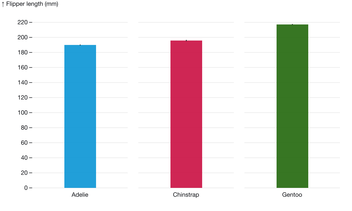
The bar chart, with the parts that are doing no work
About nine tenths of each bar sits below the shortest flipper measured in that species, where there are no data at all, and the error bar is a quantity most readers will misread.
- The outlined area is the part of the bar below the shortest flipper measured in this species, 172 mm. It is about nine tenths of the bar, and not one of the 151 birds is in it. This is the region Newman and Scholl found readers treat as more probable than the space just outside the bar.
- The error bar is here, and it is about half a millimetre. Standard error shrinks as the sample grows, so on 151 birds it says almost nothing about how much the birds differ from each other.
- The axis starts at zero, which is correct for bars, and the consequence is that the whole interesting range is squeezed into the top fifth of the plot. Bars need a zero baseline, and a zero baseline spends the plot on a quantity that never goes near zero.
Drawn as position instead
Once the bars are gone the axis no longer has to start at zero, the plot can spend its height on the range the data occupy, and every bird is placed rather than summarised. This is the same comparison, encoded as position on a common scale, which is the encoding Cleveland and McGill found people read most accurately.
Flipper length by species, every bird drawn
Adelie and Chinstrap overlap across most of their range. Gentoo barely touches either. That is a different sentence from the means differ, and it is usually the one a reader wants.
Why this is a science and not a style
Franconeri, Padilla, Shah, Zacks and Hullman reviewed this literature in 2021 for Psychological Science in the Public Interest, and the title is the argument: the science of visual data communication, what works. There is a body of experimental results here, with methods, effect sizes and replications, and it is not a collection of opinions about what looks nice.
Worth noting, on a site that publishes its own corrections prominently: that review issued a corrigendum the following year. A field that corrects itself in public is behaving like a science, which is rather the point.
None of this means a figure cannot also be beautiful, or that judgement stops mattering. It means the judgement has something to answer to. When someone says they prefer the bar chart, there is a reasonable next question, and it is not about preference.
What changed, and what did not
- Bars replaced with one point per bird. Nothing is aggregated away.
- Points positioned by a deterministic dodge rather than random jitter, so the figure is identical on every build and two readers see the same picture.
- Standard error bars removed. The mean is drawn as a rule across each group and labelled, and the spread is visible directly rather than summarised.
- The y axis no longer starts at zero, which is legitimate once a mark’s position rather than its length carries the value.
- Species separated into panels, which makes room for the points to spread.
- One colour for every point. The panel and its label already identify the species, so hue was restating the axis.
- Group sizes written on the figure. Three groups of 151, 68 and 123 birds should not look equally certain, and on the bar chart they did.
What did not change is the data. Every figure here is drawn from the same 342 measurements, and the point of the piece is that this is exactly the problem: the numbers were never in question.
References
- Cleveland WS, McGill R. Graphical perception: theory, experimentation, and application to the development of graphical methods. Journal of the American Statistical Association 1984. 10.1080/01621459.1984.10478080
- Newman GE, Scholl BJ. Bar graphs depicting averages are perceptually misinterpreted: the within-the-bar bias. Psychonomic Bulletin & Review 2012. 10.3758/s13423-012-0247-5
- Correll M, Gleicher M. Error bars considered harmful: exploring alternate encodings for mean and error. IEEE Transactions on Visualization and Computer Graphics 2014. 10.1109/tvcg.2014.2346298
- Heer J, Bostock M. Crowdsourcing graphical perception: using Mechanical Turk to assess visualization design. CHI 2010. 10.1145/1753326.1753357
- Franconeri SL, Padilla LM, Shah P, Zacks JM, Hullman J. The science of visual data communication: what works. Psychological Science in the Public Interest 2021. 10.1177/15291006211051956. Corrigendum 2022, 10.1177/15291006221099494
- Horst AM, Hill AP, Gorman KB. palmerpenguins: Palmer Archipelago (Antarctica) penguin data. 2020. 10.5281/zenodo.3960218. CC0