Jet
The rainbow colourmap puts its brightest colour two thirds of the way up, and its top and bottom are nearly the same shade of dark.
The case against the rainbow is usually made by assertion. It is prettier than it is useful, it is not perceptually uniform, everyone should stop. All true, and none of it tells you what it is doing to your figure.
Here is one confocal plane of mouse embryo nuclei, deposited under CC BY in the Image Data Resource. The same array of numbers, mapped through two colourmaps, with nothing else changed.
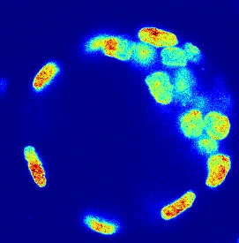
jet
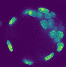
viridis
Channel 1, DAPI, of image 6001240 from study idr0062. Identical data, identical display range, identical everything except the map from value to colour. Jet gives each nucleus a red core that reads as a hot spot; those cores are the same values viridis renders as a smooth continuation of the gradient around them.
Look at the nuclei in the left-hand image. Each has a red centre with a fairly sharp edge to it, and your eye reads that edge as a boundary between two things. There is no boundary. The values slide smoothly from the rim to the middle, and you can see them doing it on the right.
Why it happens
A colourmap has one job: turn a number into a colour so that the reader can turn it back into a number. Nearly all of that work is done by lightness. Hue is decoration on top of it, which is why a sequential map has to get brighter the whole way up and never dim.
How bright each colourmap is, along its length
Relative luminance against position in the map. Viridis climbs from 0.02 to 0.78 and never falls back. Jet reaches its brightest at 65% and then drops to 0.05, which is almost exactly where it started. The bands you can see in the image above are the corners in this line.
Two things follow from that shape, and both are measurable.
The steps are not even. Where the line is steep, a small change in value makes a large change in lightness, and the reader sees an edge. Where it is flat, a large change makes none, and the reader sees nothing. Summed across the whole map, jet reverses direction by 97.9% of its own lightness range. Viridis reverses by 0.07%. That is the same measure this site screens its own sequential palettes with, and anything above a few percent fails.
The top and the bottom are the same colour. Not the same hue, obviously, but lightness is what survives. Jet ends at luminance 0.05, having started at 0.02. Print it, photocopy it, or read it with no colour vision at all, and the highest values in your data are as dark as the lowest.
What that costs, in greys
Here are the same two images with the colour taken out, which is what a greyscale printer does and what a reader with achromatopsia has always had.
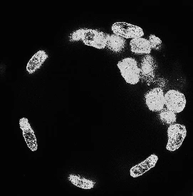
jet, luminance only
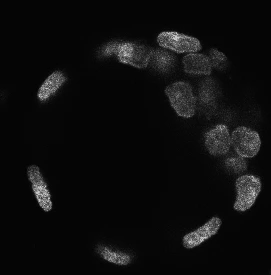
viridis, luminance only
The same two images, as luminance only
Converted to relative luminance, the measure that survives greyscale printing. In the jet version the nuclei have gone hollow: the red centres, which were the highest values, are now darker than the ring around them, so the structure reads inside out. Across this image jet separates the brightest and darkest one percent of the data by 54 grey levels out of 255. Viridis separates them by 145.
The nuclei have turned inside out. The brightest signal in the data is now the darkest part of each nucleus, because the highest values were red and red is dark. A reader could describe that image accurately and be wrong about the biology.
One honest complication
We first built these images with the display range set to the plane’s own minimum and maximum, which is the obvious thing to do. On that version jet came out ahead: separation of 135 grey levels against viridis on 104.
That result was an artefact. A single hot pixel set the ceiling, so almost nothing in the image reached the top of the colourmap and jet’s dark red end was never used. Switching to the percentile display range this site already uses on this study, which exists precisely so one pixel cannot set the ceiling, gives the numbers above.
Both runs are honest measurements. Only one of them measured a picture anybody would publish, and we would not have known which without checking. That is the real argument against jet, and it is not aesthetic: whether the map ruins your figure depends on where your data happen to sit inside it, and you cannot tell by looking.
What to use instead
Viridis, cividis, magma or any of the scientific colour maps published with Crameri, Shephard and Heron’s 2020 paper. They are in matplotlib, R, Fiji and Napari already, and switching is one argument to one function call.
If you want them as ready-made files, the palettes page has viridis and cividis as Fiji lookup tables, and the pre-submission checklist has this on it as one line.